Annually, Pantone's color specialists carefully select a hue to serve as a symbol for the year's most significant design event. This color has a huge impact on the design industry for the rest of the year, especially in the industries of fashion, cosmetics, technology, and interior design. While looking forward to the next year’s trend, we introduce you to this year’s winner color: a vibrant periwinkle called Very Peri, expected to follow in the footsteps of its predecessors.
Before starting our decoration journey, the first thing that needs to be done is to become familiar with this unique hue selected by the Pantone team, which is made up of sociologists, psychologists, and designers. Particularly the era in which we are living is symbolized by the periwinkle, a flower that is full of hope and possibility. That is, the living area is considered a sanctuary, an intimate space that we feel ourselves most comfortable. Therefore, special attention should be paid to the decoration of these spaces since they profoundly influence our mental and psychological state. Marked as the PANTONE 17-3938 code, there is the possibility to look for and locate the periwinkle, typically found in the lavender flower.

Periwinkle, a hue that is a blend of lavender and blue, is an incredibly striking tint. The color relatively presents a dark shade. Therefore, it is critical to utilize periwinkle in light shades and primarily in accessories for a visually appealing décor. Note that a little bit of periwinkle can usually go a long way.
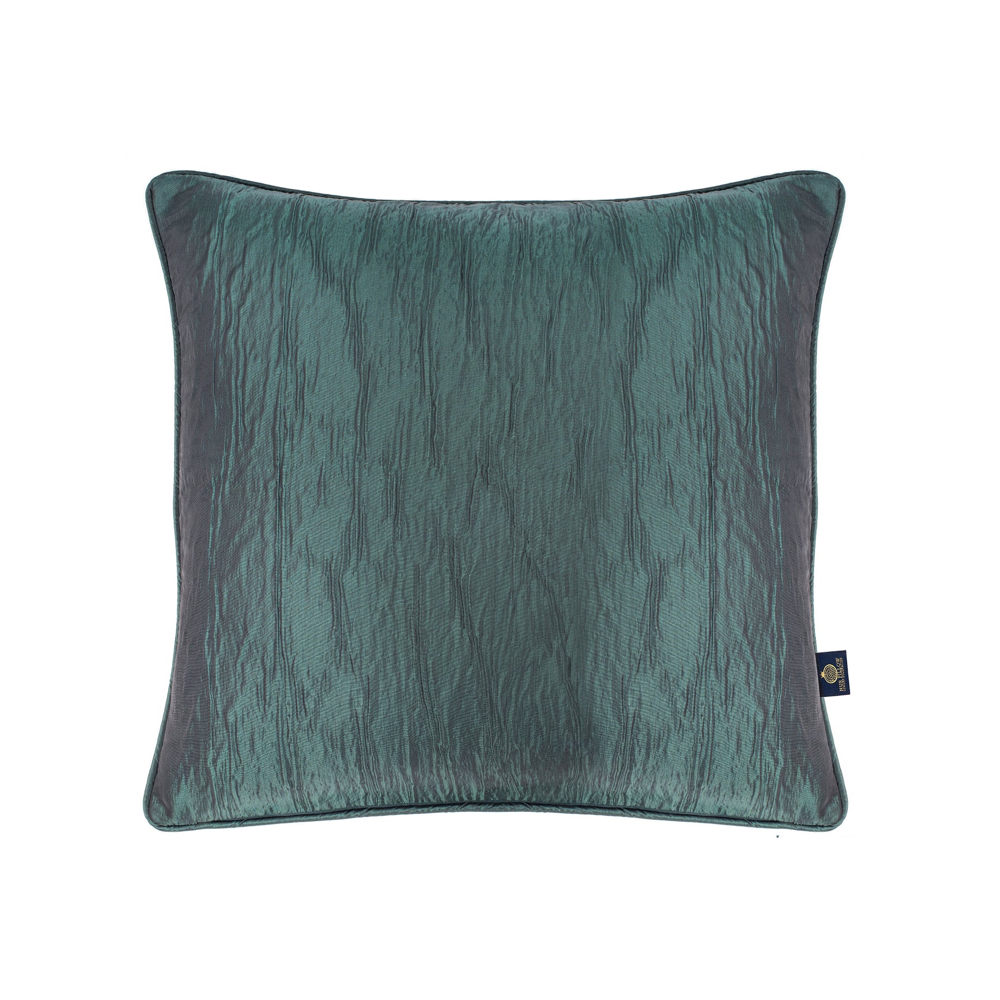
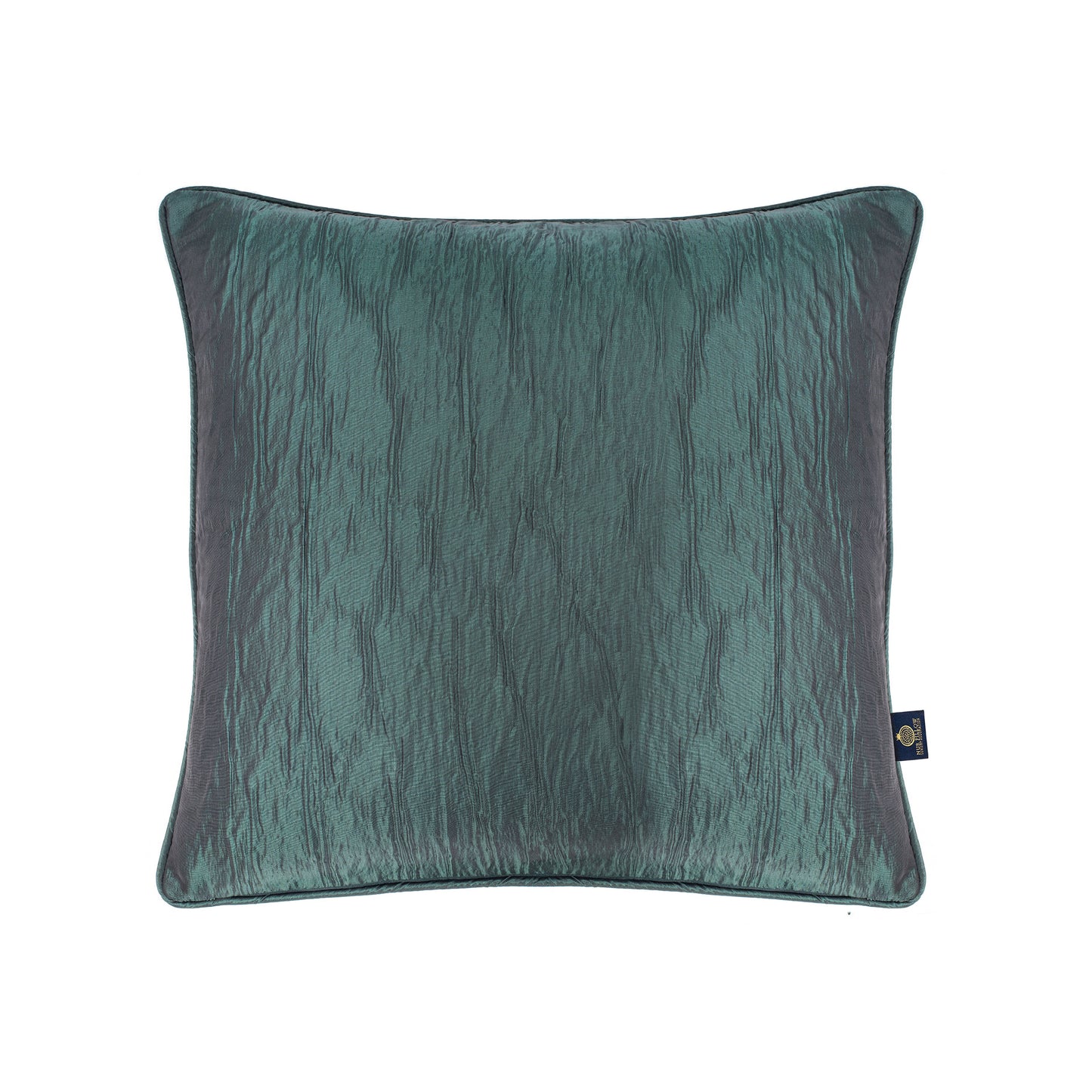
Periwinkle evokes positive emotions and gives a sense of serenity. Therefore, it may be used to decorate any room in the house, from the bathroom to the bedroom and particularly the living room. You may consider making combinations of periwinkle with your elegant pillows. Note that if combined correctly, periwinkle has the potential to give a room a serene vintage appeal.
The base shade of periwinkle is purple. Significantly, purple is a bright combination of two hues: blue and red. These two colors add a balance of vibration and serenity, which makes periwinkle both appealing and calming. As a vibrant blend of these two colors, purple is assumed to inspire joy, creativity, and imagination. It makes an excellent color to refresh your home for the new year by triggering positive, calming sensations.
Considering the sensational influence on your emotions, periwinkle can be used in furniture, accessories, and paint colors to add an energizing jolt of vitality to the spaces you create, when it comes to decoration. In this article, we provide you with the
most useful and stylish ideas to decorate your living spaces with periwinkle. These ideas will show you how to design any space using Pantone's color of the year. To follow up on the latest trends and give some creative touches to your house, keep reading our periwinkle exploration.

How much and where should I use periwinkle?
Periwinkle is a daring paint color that is distinguished by its vibrancy and sense of joy. If only a tiny amount is used, it is able to enliven spaces without making them feel overly opulent. Periwinkle can be used to modernize an accent piece of furniture or to paint the walls of a powder room. The hues of blue and red create a combination of an elegant appearance. If you prefer working in a calm and elegant environment, consider painting your kitchen island or base cabinetry periwinkle. This atmosphere will make an immediate difference, giving you motivation and inspiration. You may also use it to draw attention upward in your living room or hallway. It is worth noting that periwinkle is more appropriate for large areas than to appear in tiny details or small-size decorations. Therefore, painting your hall or a large wall will foreground the color’s influence.
In an environment that is generally monochromatic, periwinkle adds a lovely splash of color. Introduce this bold color with a single statement piece, such as a large piece of artwork or a chair upholstered. For example, a table in a modern dining room will be anchored by a faux cowhide rug in a vibrant shade of periwinkle. Such a rug also adds an eccentric touch to the room. Moreover, it gives profundity since dark shades of purple are inviting and appeal to the unconscious. The dreamy atmosphere highlights the relatively bright colors. Therefore, if you want to emphasize the light, shiny furniture, using periwinkle in the background will be a smart decoration hack.

Using Periwinkle in Large Spaces
Very Peri is a vibrant color with the potential to be overpowering if used liberally in larger settings. Choose a paint chip from a palette of blue-tinged purples, then choose the purplish-blue color that is the palest of the lot to offer a bit of color without overwhelming the room. The walls in this dining room are painted a light periwinkle, but the trim and furnishings are all black for a more contemporary aesthetic. In this fashion, the living area gains a unique style that orchestrates the dark shades. Therefore, using white light for illumination will promote the effect of the dominant purple.
As a warm variety of blue, periwinkle works well in bedrooms because it evokes feelings of coziness and familiarity. This is important when it comes to decorating or coloring the spaces you reserve for sleeping. These places should provide the most appropriate environment for healthy sleep. Therefore, they should not be dominantly comprised of flash or hot colors such as red, phosphorated orange tones, bright or glittering pink etc. A cozy atmosphere with darker or calmer colors, on the other hand, add to the serenity and calmness of the room. Thus, you will be able to sleep more comfortably and experience a sense of calm if you choose to decorate your bedroom in a single tone. To construct this design, you can create a cozy environment on your bed by incorporating the hue through accent exclusive pillows. Light-colored bedsheets are best combined with the shades of blue if you fall asleep in darker environments more easily. You can also make a sophisticated look by hanging long, flowing periwinkle linen drapes. The color looks especially sumptuous on velvety textiles like velvet.

For a boost in energy and creativity, you might find it helpful to decorate your workspace or living area with a color combination like periwinkle and crimson. But this, again, means using periwinkle in large areas to increase its effect. Many designers contend that green shades and purple address intellect and creativity. They give inspiration when they are the dominant color in the environment. That is why we usually are more creative and inspirational in natural places surrounded with trees and plantations. Given this effect, tall or large walls in periwinkle support your motivation in working places. Since it is a matte color, it does not distract your attention and helps you to focus on your study or inspirational occupation.
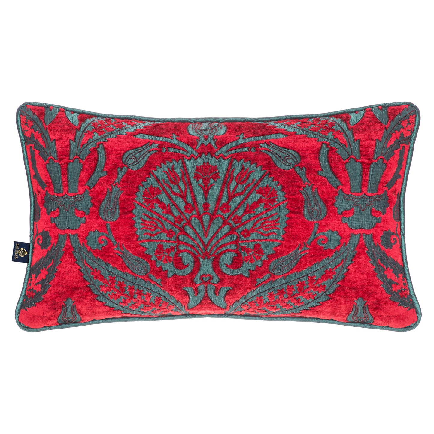
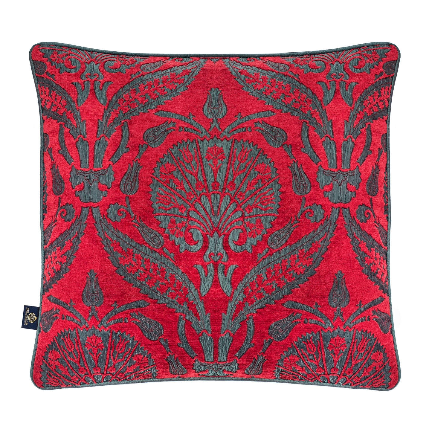
Fabrics are an additional potential application for this color, in addition to bookcases, walls, and accessories. In this sense, curtains, bedcovers, decorative scarves, armchairs, plush cushions, chic pillows or covers are prominent subjects in periwinkle. Besides, if you pattern the color with various shades of orange, you will also create a mystic atmosphere. Although previously, this mystic effect was majorly provided with the use of brown shades. However, this insistence on the dull tones of brown only gave an old-fashion look rather than an inviting mystic appearance. The new trend, therefore, shifted to the combination of purple, gold, and orange.

In addition to walls and large fabric areas, you can use periwinkle on floor coverages, or combine the color with alternatives. Include a floor that is of a neutral gray color, since this will look well with the periwinkle walls. Because flooring is typically more costly and a more permanent layer of design, adopting a neutral shade of gray rather than periwinkle helps to ensure that it will last for a longer period of time. Choose wood flooring that have gray undertones and come in a choice of hues that are either mild or dark. Alternately, if you want to highlight the color of the walls in the room without having to replace the carpet as frequently as you would with lighter variations, choose a carpet with a medium-gray tone. Any room would benefit from the addition of a periwinkle, gray, and white area rug with patterns that match the aesthetic of the room. Place it under the main furniture grouping to serve as an anchor for the area and to integrate the colors of the room for an appearance that is visually cohesive.

Periwinkle on the Tiny Decorations
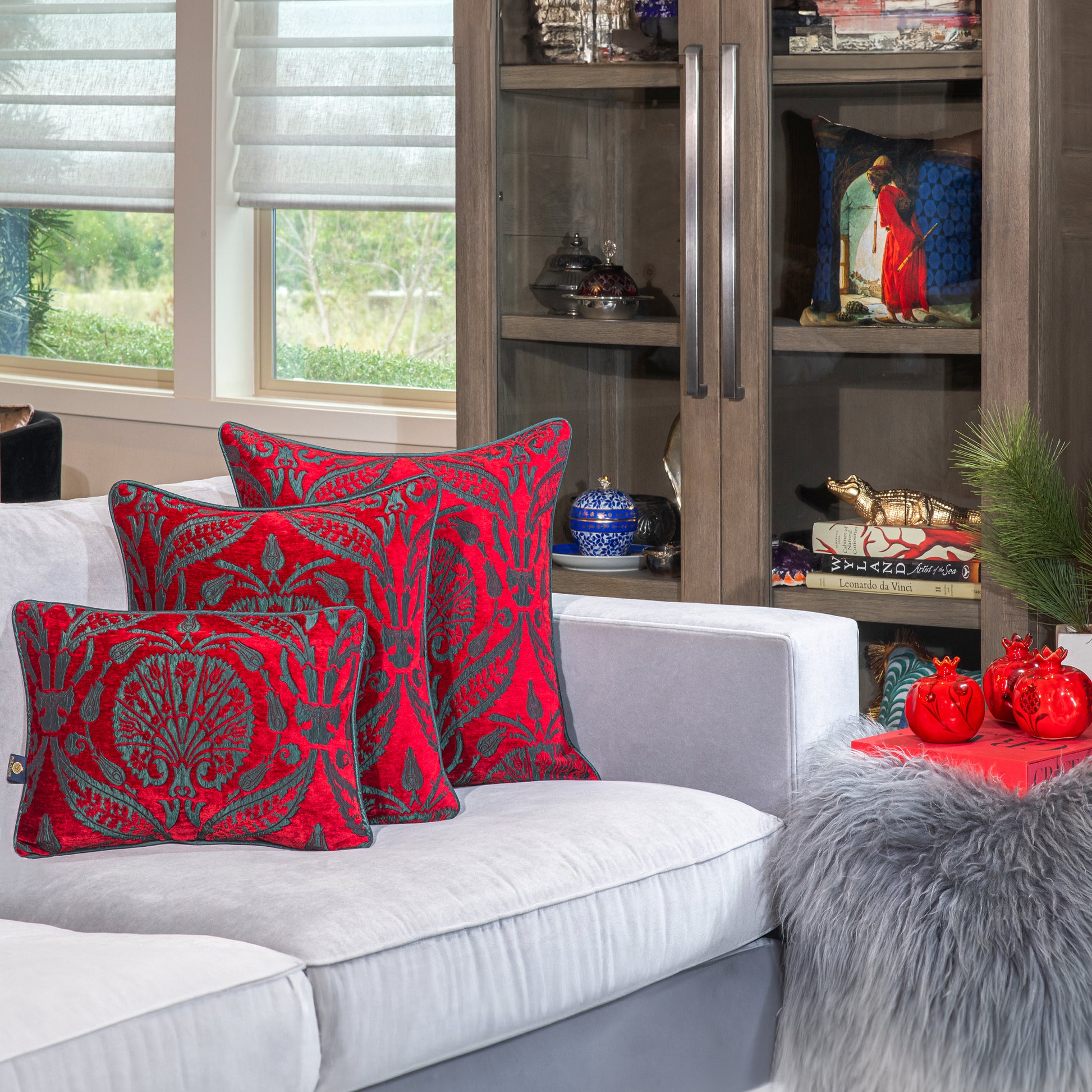
There are other ways to experiment with Very Peri that do not include making a long-term commitment to a new paint color or purchasing brand-new furniture. Let us consider you are going to decorate your living room in periwinkle. Begin by choosing a purple-covered coffee table book, a vase loaded with purple flowers, artwork with a periwinkle color scheme, or a set of glassware with a violet hue. Covering your sitting set might not be a good idea, since they are relatively large furniture and may give a dull atmosphere to your room. Therefore, rather than highlighting the color with such furniture, consider using comfortable throw pillows in shades of a complementary periwinkle. Persist with the color for a while by adding table covers or runners. And if you like how it looks, you should consider expanding its use in your color schemes, such as curtains or picture frames.
Given how commonly this color can be seen in flower gardens, it should come as no surprise that it blends well with other natural hues. An emphasize on natural elements in your decoration requires using shades of brown, though. However, periwinkle is one significant complementary color that adds vitality to brown. If you want to aim for a peaceful and calming effect, try a palette of similar colors like sky blue and spring green. To achieve a more sensuous effect, consider accent colors with deeper tones, such as forest green and cobalt. Such a combination will keep periwinkle from appearing too sweet.

How Does Periwinkle Change the Atmosphere When Used in Large Areas?
People who want to distinguish their walls using color should consider periwinkle as their best option. Because it is easy to apply, as a simple and effective approach to differentiate interiors. Therefore, we can expect to see this hue used primarily on the walls in this year’s fashion trend.
When employed in either its dark or light iteration, periwinkle has the ability to transform a room's appearance in terms of its size, style, and sense of openness. That is, it gives a deepening effect due to the characteristic of blue it contains. In many areas, blue is associated with depth and profundity. Therefore, when used on large areas, even in small rooms, it makes the space appear larger than it is. This impression enables you to enlarge the appearance of narrow spaces. Possessing a great deal of promise, thus, this color can be utilized on its alone. Plus, you can increase the enlargening effect by combining periwinkle with a variety of other hues, especially bright or contrasting colors to emphasize it. In other words, when used in conjunction with lighter colors, such as cream or pale yellow, periwinkle has the potential to give the impression that the space is larger than it actually is.
On the other hand, the effect can be changed if you consider sticking to colors with similar shades. When combined with dark colors like burgundy, scarlet, or dark blue, for example, periwinkle has the potential to make the space appear more neatly arranged and put together than it would otherwise. Note that darker colors indicate elegance in many areas. Therefore if you don’t mind a darkened atmosphere, try combining periwinkle with bronze, dark green, or orange.

Conclusion
The interior design examples prove that the new year’s trend, periwinkle, is a perfect background color that elevates your living space. Unlike the other dark shades such as brown, dark-blue/green, grey, or black, periwinkle appeal to your inspiration while providing serenity. Now that you have seen many exemplary uses of this wonderful color, visit our product catalogue to find the best periwinkle exclusive pillow that will complete your modern trend.